Outside the Box, Inside the Brain: Why OOH Build-Outs Stand Out
June 18, 2024
Do you know what “predictive processing” is? (Don’t worry, it’s not AI.)
It’s the shortcut our brains take that allows us to more automatically and subconsciously understand stimuli that match our expectations. Its flip side is that when we encounter things that don’t match our expectations, we need more time and energy to make sense of them. It’s the difference between seeing a can of soda when you open the refrigerator vs. opening it and seeing a pair of shoes in the crisper.
That extra effort to decipher those deviations is called “congruency cost.” It’s why we remember fewer details about the familiar and pay more heed to what’s novel.
Okay, cool psychology lesson, but what does that mean for out of home advertisers? Simply put: the unexpected commands attention.
That’s why social feeds so frequently feature dimensional OOH creative (better known as 3D billboards). But why should digital out of home have all the fun?
Spoiler alert: it doesn’t!
So, when Paramount+ wanted to drive awareness and tune-in for the second season of its Halo series, we helped the streamer mount the iconic Master Chief helmet on two of its Los Angeles billboards, in three dimensions and with a video screen for the visor! This screen showed teasers from the season, with the content updated every two weeks. (You can watch the installation here.)
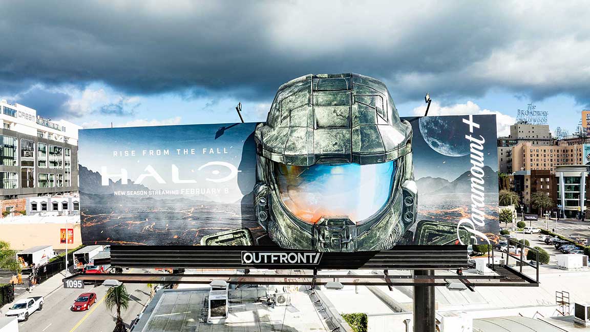
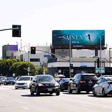
In addition to the digital out of home presence needed by streamers to promote a never-ending stream of new content, P+ also maintains a significant portfolio of static perms – long-term exclusive deals for assets in the most critical locations. Perms are an important part of the strategy too, because having great assets already on lock is easier than securing them every time there’s a new show ready to hype. It’s at these traditional statics where brands can use their creativity with buildouts, extensions, and other embellishments.
These embellishments subvert our expectations of billboards as two-dimensional rectangles. When creative refuses to be restrained by the dimensions of the canvas or when it pops through the fourth wall and into the third dimension, our predictive processing throws an error message and our conscious awareness kicks in.
“Especially in LA, entertainment brands have done such a great job at thinking beyond the 14’-by-48’ rectangle, really dreaming up these cool ways to use the space,” said Joanna Sbordoni, OUTFRONT Account Executive. “Over the past couple of years, it’s become kind of a competition.”
And that includes the studios as well as the streamers. Sony Pictures’ new Garfield movie topped the box office in its opening weekend after topping ten Los Angeles billboard bulletins with three different extended creatives. But Sony didn’t stop there, outfitting two boards on the Sunset Strip and in Westwood with a fuzzy 3D Garfield pop-out with animatronic eyes. No, you didn’t eat the wrong chocolates. A giant plushie cat on a billboard just blinked at you.
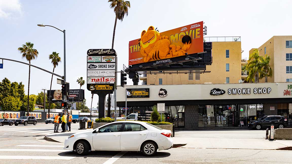
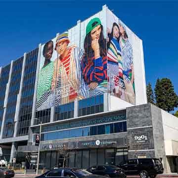
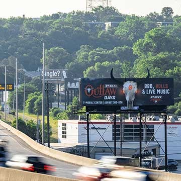
Other embellishments advertisers can make to static billboards include two-dimensional popouts, three-dimensional props, inflatables, lighting effects, cutouts, digital countdowns, and even sequins!
It’s not just for billboards either. Hydration aid Liquid I.V. rolled out its new-look packaging with a captivating three-dimensional model of the product, pouring the powder into a bus shelter in West Hollywood.
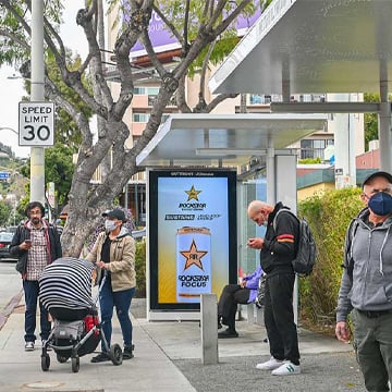
Those shelters can also incorporate elements like wraps, floor graphics, prop showcases, digitals, lenticulars, and mirror substrate to fully immerse commuters while engaging motorists and pedestrians.
Have these examples encouraged you to think outside the box? We’re ready to talk about how to take your next campaign there.
Author: Jay Fenster, Marketing Manager @ OUTFRONT
Links to third-party content are not endorsed by OUTFRONT Media.
